


 Anglais
 Espagnol
 Portugais
 Italien
 Allemand
 Japonais
Portfolio TimeMap
Contenu des pages
La plupart des analyses de performance répondent à une seule question : Que vaut cette stratégie ? Bénéfice net, facteur de profit, prélèvement, Sharpe — tout cela réduit la vie entière d'une stratégie à une poignée de chiffres. Mais pour un portefeuille multi-stratégie, il y a une deuxième question qui compte tout autant et presque rien ne vous montre : quand chaque stratégie en fait échanger ?
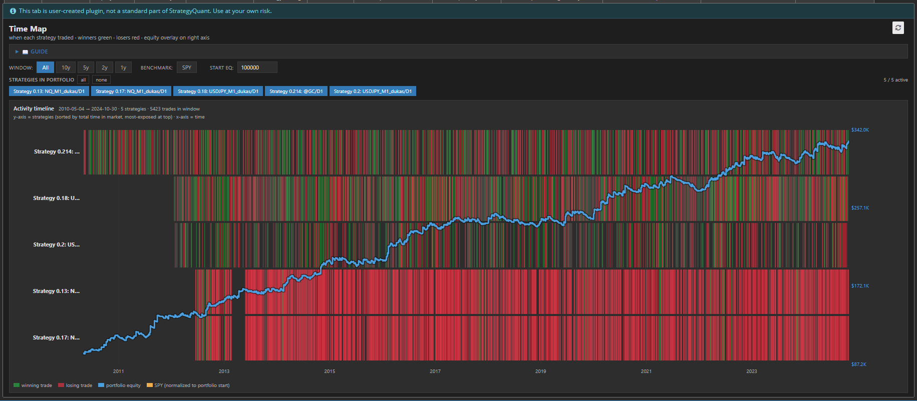
C'est le fossé TimeMap remplit. Il s'agit d'un plugin « StrategyQuant X ResultsPlugin » qui transforme l'historique des ordres de votre portefeuille en une carte temporelle — une vue d'ensemble permettant de savoir qui était présent sur le marché, à quel moment, et si A fonctionné.
Ce qu'il faut faire il spectacles
TimeMap présente votre portefeuille sous la forme d'un chaleur carte plus temps
- Une ligne par stratégie, classées par temps total sur le marché — vos stratégies les plus exposées se trouvent en haut.
- Blocs verts marquer les transactions gagnantes, blocs rouges marquer les perdants, positionnés exactement là où ils se sont produits sur la chronologie.
- Une ligne de crédit hypothécaire bleue superpose le tout sur l'axe de droite, ce qui permet de lier l'activité à la valeur du portefeuille.
- Un indice de référence SPY orange optionnel (récupéré en direct) montre ce qu'une stratégie passive d'achat-conservation aurait donné sur la même période, normalisée par rapport à votre capital de départ.
En un coup d'œil, vous pouvez lire le forme du risque de votre portefeuille — quelque chose qu'aucune statistique table peut exprimer.
Pourquoi le timing est les caché risque
Deux portefeuilles peuvent avoir des rendements identiques et des baisses maximales identiques tout en étant totalement différents en matière de risque réel. Les différence est chevauchement.
Si toutes les stratégies débarquent sur le marché aux mêmes moments, vous n'avez pas dix stratégies, vous avez une seule stratégie avec dix déguisements. Lorsque ce régime change, tout chute ensemble. TimeMap rend cela instantanément visible : un bande verticale rouge sur chaque rangée pendant la même période est la signature classique d'une, corrélé risque.
L'inverse — des stratégies qui s'illuminent à différents fois, remplissant les calmes étendues de l'autre — est une véritable diversification. TimeMap vous permet de voir un timing complémentaire au lieu de en supposant que le.
Construit pour exploration
La carte est interactive et tout se recalcule instantanément sans re-backtester
- Commandes de la fenêtre (Tout / 10 ans / 5 ans / 2 ans / 1 an) zoomez sur la plage de temps pour analyser une crise ou une époque spécifique.
- Puces de stratégie vous permet d'activer ou de désactiver des stratégies individuelles — la courbe de capital se recalcule à la volée à partir de ce qui est sélectionné, ce qui vous permet de tester “ et si j'abandonnais celle-ci ? ” en un clic.
- Capital de départ réglable redimensionne la couverture d'actions.
- Basculement SPY laisse tomber le benchmark.
- La carte fait défiler verticalement pour les grands portefeuilles tandis que les axes du temps et de la valeur restent épinglés en place.
Les détails que fabriquer il utilisable
TimeMap est a unique autonome HTML fichier - non Python, non backend, non configuration. Il restitue croustillant SVG à tous résolution, supports à la fois lumière et sombre SQX apparences, et poignées portefeuilles avec des milliers de commandes sans étouffement. Perdre métiers sont dessiné premier et gagnants à plusieurs couches sur Super, donc a rentable stratégie dit vert même où métiers chevauchement. Instant métiers toujours montrer comme mince marqueurs donc rien disparaît.
Les bas ligne
Les statistiques vous disent si une stratégie est bonne. TimeMap vous dit si vos stratégies aller ensemble. For anyone building portfolios in StrategyQuant X, it turns an abstract worry — “are these correlated?” - en something vous peut simply regarder à et see.
