


 Inglés
 Portugués
 Francés
 Italiano
 Alemán
 japonés
Portafolio TimeMap
Contenido de la página
La mayoría de los análisis de rendimiento responden a una sola pregunta: ¿Qué tan buena es esta estrategia? Beneficio neto, factor de beneficio, *drawdown*, Sharpe: todo ello colapsa la vida entera de una estrategia en un puñado de números. Pero para un cartera multiestragia, hay una segunda pregunta que importa tanto y casi nada te muestra: cuando cada estrategia en realidad ¿Comercio?
Esa es la brecha Mapa de tiempo rellena. Se trata de un plugin de resultados StrategyQuant X que convierte el historial de órdenes de tu cartera en un mapa temporal: una visión general de quién estaba en el mercado, cuándo y si Funcionó.
Qué it espectáculos
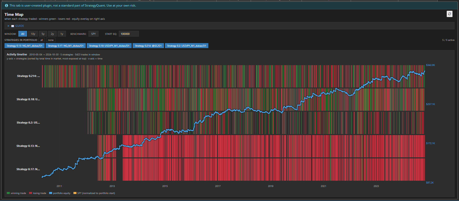
TimeMap presenta tu portafolio como un calor mapa en tiempo
- Una fila por estrategia, ordenadas por el tiempo total en el mercado; tus estrategias con mayor exposición se encuentran en la parte superior.
- Bloques verdes marcar las operaciones ganadoras, bloques rojos marca a los perdedores, posicionados exactamente donde ocurrieron en la línea de tiempo.
- Una línea de crédito hipotecario azul superpone todo en el eje derecho, para que puedas vincular la actividad al valor de la cartera.
- Un punto de referencia SPY naranja opcional (obtenido en tiempo real) muestra cómo le habría ido a una estrategia pasiva de comprar y mantener durante el mismo período, normalizada a su capital inicial.
De un vistazo puedes leer el forma del riesgo de tu cartera, algo que ninguna estadística tabla puede expresar.
Por qué la sincronización es el oculto riesgo
Dos carteras pueden tener rendimientos idénticos y reducciones idénticas y aun así ser muy diferentes en cuanto al riesgo en el mundo real. En diferencia es superposición.
Si todas las estrategia se lanzan al mercado en los mismos momentos, no tienes diez estrategias; tienes una sola estrategia con diez disfraces. Cuando ese régimen cambia, todo cae junto. TimeMap hace que esto sea visible al instante: un franja vertical roja en cada fila durante el mismo período es la firma clásica de sistémica, correlacionado riesgo.
Lo opuesto — estrategias que se iluminan en diferente veces, llenando los tramos silenciosos del otro, es una verdadera diversificación. TimeMap te permite ver la sincronía complementaria en lugar de suponiendo eso.
Construido para exploración
El mapa es interactivo y todo se recalcula al instante sin volver a probar
- Controles de ventana (Todos / 10a / 5a / 2a / 1a) amplía o reduce el rango de tiempo para poder analizar en detalle una crisis o época específica.
- Fichas de estrategia te permite activar y desactivar estrategias individuales: la curva de capital se recalcula sobre la marcha a partir de lo que esté seleccionado, para que puedas probar “¿y si elimino esta?” con un solo clic.
- Capital inicial ajustable recala la cobertura de acciones.
- Alternar SPY deja caer el punto de referencia dentro o fuera.
- El mapa desplaza verticalmente para carteras grandes mientras los ejes de tiempo y valor permanecen fijos en su lugar.
En detalles que hacer it utilizable
Mapa de tiempo es a solo autónomo HTML archivo - no Python, no backend, no configuración. En representaciones crujiente SVG en cualquier resolución, apoya ambos luz y oscuro SQX apariencias, y manijas carteras con miles de pedidos sin ahogamiento. Perdiendo comercios son dibujado primero y ganadores en capas en cima, así que a rentable estrategia dice verde incluso donde comercios superposición. Instante comercios aún mostrar como delgado marcadores así que nada desaparece.
En inferior línea
Las estadísticas te dicen si una estrategia es buena. TimeMap te dice si tus estrategias pertenecen el uno al otro. Para cualquiera que esté creando carteras en StrategyQuant X, esto convierte una preocupación abstracta —“¿son estas correlacionados?” - en algo usted puede simplemente mira en y ver.
