


 Inglês
 Espanhol
 Francês
 Italiano
 Alemão
 Japonês
Portfólio TimeMap
Conteúdo da página
A maioria das análises de desempenho responde a uma pergunta: Quão boa é esta estratégia? Lucro líquido, fator de lucro, rebaixamento, Índice Sharpe — tudo isso comprime a vida inteira de uma estratégia em um punhado de números. Mas para um portfólio multiestratégia, há uma segunda pergunta que importa tanto quanto e quase nada te mostra: quando cada estratégia de fato Trocar?
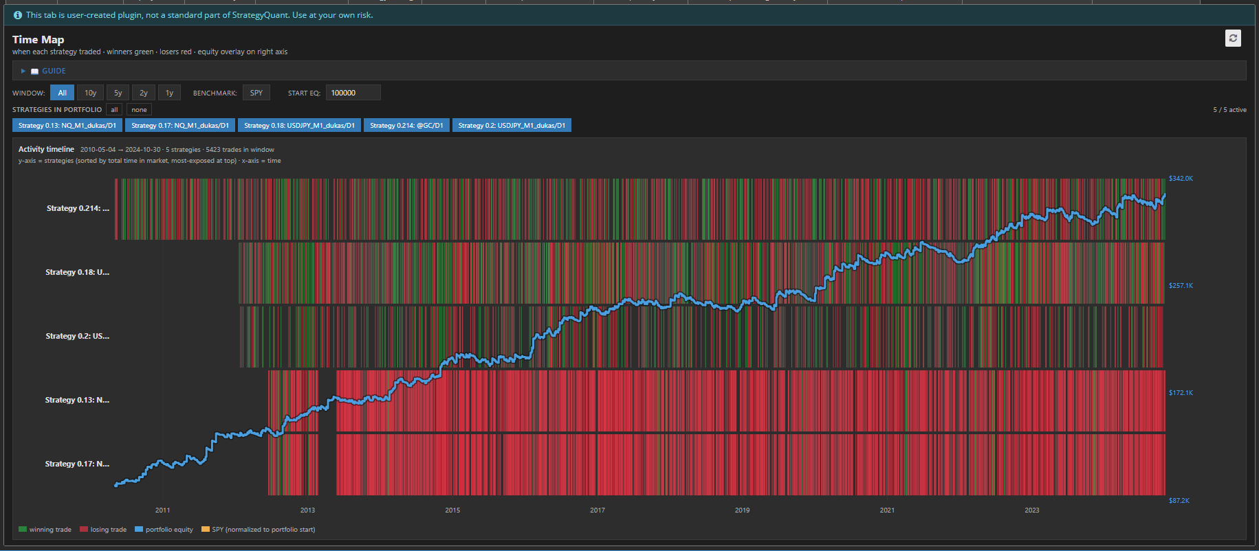
Essa é a lacuna TimeMap preenche. Trata-se de um plugin StrategyQuant X ResultsPlugin que transforma o histórico de ordens do seu portfólio em um mapa temporal — uma visão panorâmica de quem estava no mercado, quando e se Funcionou.
O que ele mostra
O TimeMap apresenta o seu portfólio como um calor mapa sobre tempo
- Uma linha por estratégia, ordenadas pelo tempo total no mercado — suas estratégias mais expostas ficam no topo.
- Blocos verdes marcar as operações vencedoras, blocos vermelhos marcar os perdedores, posicionados exatamente onde eles aconteceram na linha do tempo.
- Uma linha de crédito imobiliário azul sobrepõe tudo no eixo direito, para que você possa vincular a atividade ao valor do portfólio.
- Um benchmark SPY laranja opcional (obtido ao vivo) mostra como uma estratégia passiva de comprar e manter teria se saído no mesmo período, normalizada para o seu capital inicial.
De relance você consegue ler o forma do risco do seu portfólio — algo que nenhuma estatística tabela pode expresso.
Por que o timing é o oculto risco
Duas carteiras podem ter retornos idênticos e rebaixamentos idênticos e ainda assim estarem a mundos de distância em termos de risco no mundo real. O diferença é sobreposição.
Se todas as estratégias entram no mercado nos mesmos momentos, você não tem dez estratégias — você tem uma estratégia com dez fantasias. Quando esse regime muda, tudo cai junto. O TimeMap torna isso instantaneamente visível: um lista vertical vermelha em cada linha durante o mesmo período é a assinatura clássica de sistêmica, correlacionado risco.
O oposto — estratégias que se iluminam em diferente tempos, preenchendo os trechos silenciosos um do outro — é a verdadeira diversificação. O TimeMap permite que você veja o timing complementar em vez de assumindo isso.
Construído para exploração
O mapa é interativo e tudo é recalculado instantaneamente sem retestar:
- Controles da janela (Tudo / 10a / 5a / 2a / 1a) amplie ou reduza o intervalo de tempo para analisar em detalhes uma crise ou era específica.
- Fichas de estratégia permite ativar e desativar estratégias individuais — a curva de patrimônio é recalculada instantaneamente com base no que estiver selecionado, para que você possa testar “e se eu remover esta?” com um clique.
- Capital inicial ajustável redimensiona a sobreposição de ações.
- Ativar/desativar SPY descarta o benchmark dentro ou fora.
- O mapa rola verticalmente para grandes portfólios, enquanto os eixos de tempo e valor permanecem fixos no lugar.
O detalhes que fazer ele utilizável
TimeMap é a único autossuficiente HTML arquivo - não Python, não backend, não configuração. Ele renderizações crocante SVG em qualquer resolução, suporta ambos luz e escuro SQX skins, e gerencia portfólios com milhares de encomendas sem engasgando. Perdendo comércios são empatado primeiro e vencedores em camadas em ótimo, assim a lucrativo estratégia diz verde mesmo onde comércios sobreposição. Instantâneo comércios ainda mostrar como magro marcadores assim nada desaparece.
O fundo linha
Estatísticas dizem se uma estratégia é boa. TimeMap diz se as suas estratégias foram feitos um para o outro. For anyone building portfolios in StrategyQuant X, it turns an abstract worry — “are these correlated?” - em something você pode simply olhar em e see.
