


 Inglese
 Spagnolo
 Portoghese
 Francese
 Tedesco
 Giapponese
Portfolio TimeMap
Contenuto della pagina
La maggior parte delle analisi delle prestazioni risponde a una domanda: Quanto è valida questa strategia? Utile netto, profit factor, drawdown, Sharpe: tutto questo riduce l'intera vita di una strategia a una manciata di numeri. Ma per un portafoglio multi-strategia, c'è una seconda domanda che conta altrettanto e quasi nulla vi mostra: quando ogni strategia in realtà scambio?
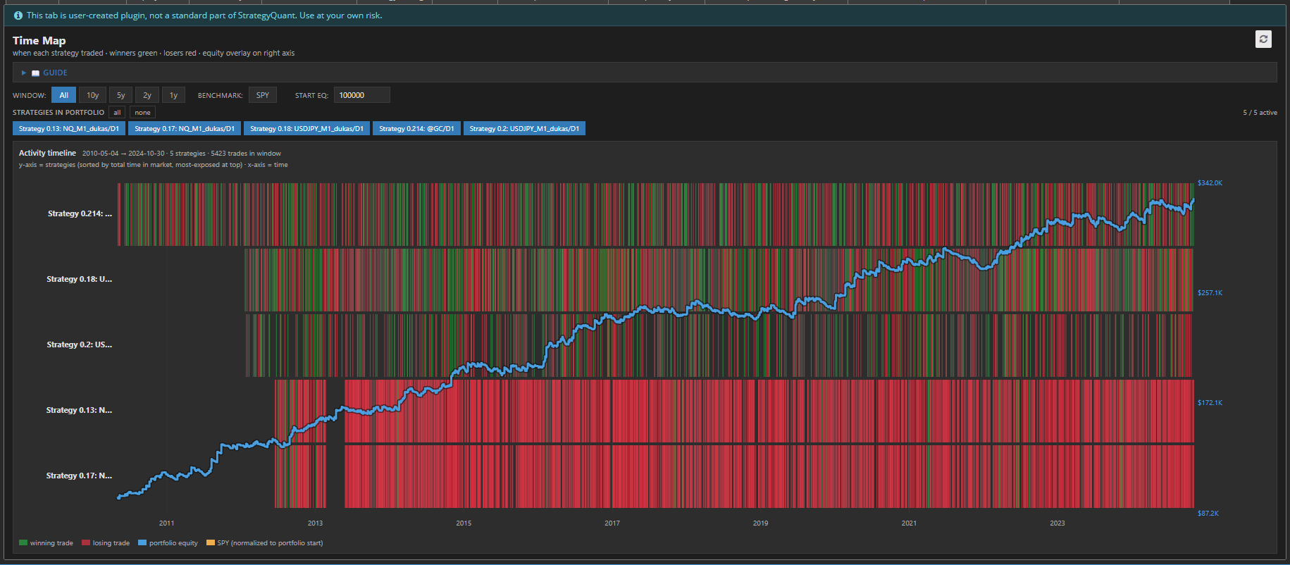
Questa è la differenza TimeMap riempie. Si tratta di un plugin StrategyQuant X ResultsPlugin che trasforma la cronologia degli ordini del tuo portafoglio in una mappa temporale — una visione d’insieme di chi era presente sul mercato, quando e se Ha funzionato.
Cosa esso spettacoli
TimeMap presenta il tuo portafoglio come un calore mappa oltre tempo
- Una riga per strategia, ordinate per tempo totale sul mercato: le vostre strategie più esposte si trovano in cima.
- Blocchi verdi segna le operazioni in profitto, blocchi rossi contrassegna i perdenti, posizionati esattamente nel punto in cui si sono verificati sulla linea temporale.
- Una linea di capitale di rischio blu sovrappone l'intera cosa sull'asse destro, in modo da poter legare l'attività al valore del portafoglio.
- Un benchmark SPY arancione opzionale (recuperato in tempo reale) mostra come si sarebbe comportata una strategia passiva di acquisto e mantenimento (buy-and-hold) nello stesso intervallo, normalizzata rispetto al capitale iniziale.
A colpo d'occhio puoi leggere il forma del rischio del tuo portafoglio — qualcosa che nessuna statistica tavolo può esprimere.
Perché tempismo è il nascosto rischio
Due portafogli possono avere rendimenti identici e drawdown identici ed essere comunque profondamente diversi in termini di rischio reale. Il differenza è sovrapposizione.
Se ogni strategia entra nel mercato negli stessi momenti, non hai dieci strategie: hai una strategia con dieci costumi. Quando quel regime cambia, tutto crolla insieme. TimeMap lo rende immediatamente visibile: un striscia verticale rossa su ogni riga durante lo stesso periodo è la firma classica di sistemico, correlato rischio.
L'opposto — strategie che si illuminano a diverso tempi, riempiendo i rispettivi spazi di quiete — è una vera diversificazione. TimeMap ti permette di vedere una tempistica complementare anziché supponendo esso.
Costruito per esplorazione
La mappa è interattiva e tutto viene ricalcolato all'istante senza nuovo backtest:
- Controlli delle finestre (Tutti / 10a / 5a / 2a / 1a) ingrandisci l'intervallo di tempo per poter analizzare in dettaglio una crisi o un'era specifica.
- Chip di strategia ti consente di attivare e disattivare le singole strategie: la curva del capitale viene ricalcolata al volo in base a ciò che è selezionato, così puoi testare “cosa succederebbe se eliminassi questa?” con un clic.
- Capitale iniziale modificabile ricalibra la copertura azionaria.
- Attivazione SPY esclude il benchmark dentro o fuori.
- La mappa scorre verticalmente per portafogli di grandi dimensioni, mentre gli assi del tempo e del valore rimangono bloccati in posizione.
Il dettagli che fare esso utilizzabile
TimeMap è a singolo autonomo HTML file - no Python, no backend, no configurazione. Esso restituisce croccante SVG a qualsiasi risoluzione, supporti entrambi luce e buio SQX skin, e maniglie portafogli con migliaia di ordini senza soffocamento. Perdere mestieri sono estratto prima e vincitori stratificato su top, così a redditizio strategia si legge verde anche dove mestieri sovrapposizione. Istantaneo mestieri ancora mostra come sottile pennarelli così niente scompare.
Il parte inferiore linea
Le statistiche ti dicono se una strategia è buona. TimeMap ti dice se le tue strategie stanno insieme. For anyone building portfolios in StrategyQuant X, it turns an abstract worry — “are these correlated?” - in something voi può simply sguardo a e see.
