


 Spanish
 Portuguese
 French
 Italian
 German
Portfolio TimeMap
Page contents
Most performance analytics answer one question: how good is this strategy? Net profit, profit factor, drawdown, Sharpe — all of it collapses a strategy’s entire life into a handful of numbers. But for a multi-strategy portfolio, there’s a second question that matters just as much and almost nothing shows you: when does each strategy actually trade?
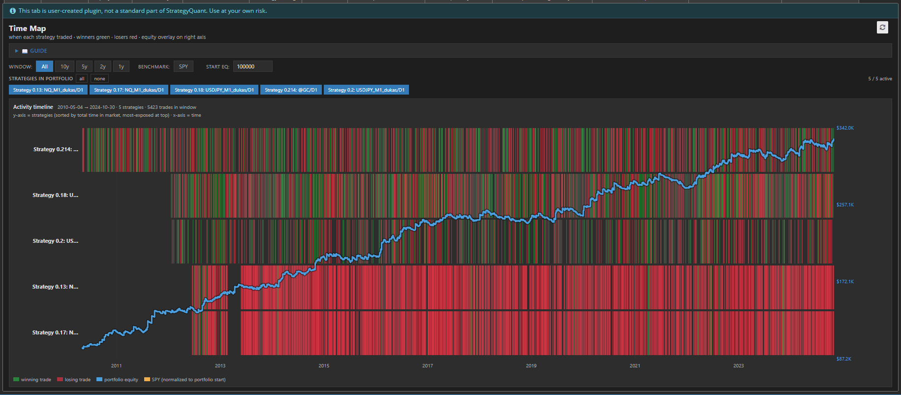
That’s the gap TimeMap fills. It’s a StrategyQuant X ResultsPlugin that turns your portfolio’s order history into a time map — a bird’s-eye view of who was in the market, when, and whether it worked.
What it shows
TimeMap lays your portfolio out as a heat map over time:
- One row per strategy, sorted by total time in market — your most-exposed strategies sit at the top.
- Green blocks mark winning trades, red blocks mark losers, positioned exactly where they happened on the timeline.
- A blue equity line overlays the whole thing on the right axis, so you can tie activity to portfolio value.
- An optional orange SPY benchmark (fetched live) shows how a passive buy-and-hold would have done over the same window, normalized to your starting capital.
At a glance you can read the shape of your portfolio’s risk — something no stats table can express.
Why timing is the hidden risk
Two portfolios can have identical returns and identical drawdowns and still be worlds apart in real-world risk. The difference is overlap.
If every strategy piles into the market at the same moments, you don’t have ten strategies — you have one strategy wearing ten costumes. When that regime turns, everything drops together. TimeMap makes this instantly visible: a vertical stripe of red across every row during the same period is the classic signature of systemic, correlated risk.
The opposite — strategies that light up at different times, filling each other’s quiet stretches — is genuine diversification. TimeMap lets you see complementary timing instead of assuming it.
Built for exploration
The map is interactive, and everything recomputes instantly with no re-backtest:
- Window controls (All / 10y / 5y / 2y / 1y) zoom the time range so you can drill into a specific crisis or era.
- Strategy chips let you toggle individual strategies on and off — the equity curve recalculates on the fly from whatever’s selected, so you can test “what if I dropped this one?” in a click.
- Adjustable starting capital rescales the equity overlay.
- SPY toggle drops the benchmark in or out.
- The map scrolls vertically for large portfolios while the time and value axes stay pinned in place.
The details that make it usable
TimeMap is a single self-contained HTML file — no Python, no backend, no configuration. It renders crisp SVG at any resolution, supports both light and dark SQX skins, and handles portfolios with thousands of orders without choking. Losing trades are drawn first and winners layered on top, so a profitable strategy reads green even where trades overlap. Instant trades still show as thin markers so nothing disappears.
The bottom line
Stats tell you whether a strategy is good. TimeMap tells you whether your strategies belong together. For anyone building portfolios in StrategyQuant X, it turns an abstract worry — “are these correlated?” — into something you can simply look at and see.
